E-commerce is a very competitive field because your rival is no more than a click away. If a customer doesn’t like your site, he simply looks for another e-commerce site to buy products from. If you want to gain more customers and attract attention, you want to make sure that your website is as usable and as customer-friendly as possible.
It doesn’t matter if your prices are very low or you have the best products in the market because if customers get confused navigating your website, reaching a preset target will likely be difficult.
Usability means that you have to make the buying process as quick and as easy as possible. These tips will let you create a more usable e-commerce website that can create higher conversion rates.
1. Sign Up Button
Avoid lengthy sign-up forms that can take a few pages or so before visitors can successfully register to your site. As an e-commerce site, you don’t actually need to know their address, phone number, what kind of work they do, etc. A simple email address and a password are just all you need. That being said, never underestimate call-to-action buttons as this help in building higher conversion rates and improving site usability. Make these call-to-action buttons stand out.

You need to think about the button size, color, font, wording and positioning. It needs to be very clear and in a color that will stand out from your website background. Moreover, local language should be taken into consideration, so use IP delivery to serve custom versions of your call-to-action button based on the customer’s location.
2. Search Function/Easy to Find Your Product
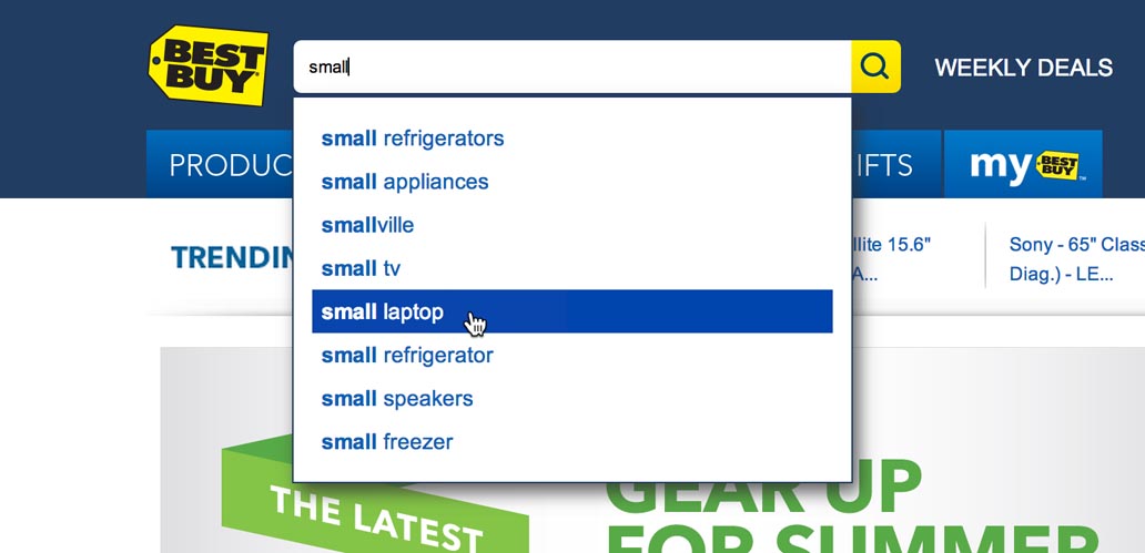
Search functionality helps customers to find what they are looking for, making their shopping experience more satisfying than frustrating. Who would want to go from one page to another, read the description of every product you have in your online store, just to find what they are looking for these days?

This is highly recommended for an e-commerce site that has a wide variety of products sold, and if it is added with category refinement, the search process can be even quicker, allowing buyers to find what they are looking for.
3. Easy to Purchase
When placing orders, customers have to know where they stand in their purchase process – how many steps have they accomplished, and how many more to go. Without breadcrumb navigation, customers will easily get bored and think your shopping procedures take forever, making them more likely to just abandon their purchases, halfway through.
Moreover, using breadcrumb navigation will help customers to go back a previous step and edit any mistakes they have made rather than start over from scratch, or give up on the whole process altogether.
4. SSL Certificate is a MUST!
No e-commerce website is complete without proper content management and personal detail security. Shoppers should feel confident in buying products at your e-commerce site, so you need to assure them that your site is a reputable site that has features to protect the privacy of your customers. Get a trust certificate like Hacker Safe or VeriSign and an updated SSL certificate to build up customer trust and offer better shopping security.

5. Mobile Friendly
This is other important factors to build successful ecommerce site. We can see that most users now access their mobile phone more often than laptop/computer. That’s why it is very important to make your site user friendly on mobile phone.